lyearn • shipped • 2026
Re-architecting org setup to work at scale
Re-architecting org setup to work at scale
Re-architecting org setup to work at scale
Turning Lyearn's rigid, one-dimensional org model into a flexible system that mirrors how companies are actually structured, to reduce set-up time significantly.
Turning Lyearn's rigid, one-dimensional org model into a flexible system that mirrors how companies are actually structured, to reduce set-up time significantly.
my role
my role
Owned research, end-to-end design and finalised the new architecture concept (with backend lead).
Owned research, end-to-end design and finalised the new architecture concept (with backend lead).
team
team
1 Product Designer (Me), 1 Design Lead, 2 Engineers
1 Product Designer (Me), 1 Design Lead, 2 Engineers
project type
project type
Full-Time
Full-Time
duration
duration
3 Weeks
3 Weeks
what’s the issue?
what’s the issue?
One rigid structure, and most companies couldn't fit
One rigid structure, and most companies couldn't fit
1
Fixed depth
Fixed depth
2
Inconsistent Duplicate Job Profiles
Inconsistent Duplicate Job Profiles
but, of course, we’re not the first ones to solve this
but, of course, we’re not the first ones to solve this
findings from market research
findings from market research
How did established HR platforms solve this?
How did established HR platforms solve this?

and we had to make it flexible, yet structured, because our clients were diverse
and we had to make it flexible, yet structured, because our clients were diverse
and we had to make it flexible, yet structured, because our clients were diverse
brain dump
brain dump
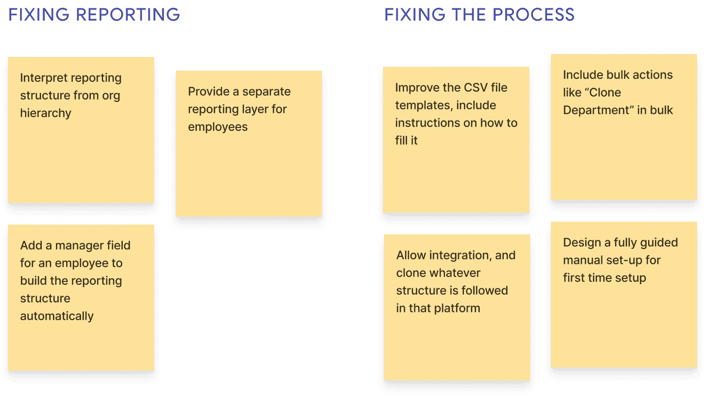
So I went to the board and dumped all ideas, good or bad
So I went to the board and dumped all ideas, good or bad
I benchmarked Workday against SMB-focused tools like HiBob and BambooHR. Every platform picks a side on flexibility. Only ours fused the two structures into one, and the fusion was what broke.
I benchmarked Workday against SMB-focused tools like HiBob and BambooHR. Every platform picks a side on flexibility. Only ours fused the two structures into one, and the fusion was what broke.


but only 3 made the shortlist, and 1 became the anchor
but only 3 made the shortlist, and 1 became the anchor
Figma inspired component and variant system for job-profiles
Figma inspired component and variant system for job-profiles
Separate the 3 structures: Orgs, jobs, and employees (reporting structure)
Separate the 3 structures: Orgs, jobs, and employees (reporting structure)
Interpret reporting structure from org hierarchy
Interpret reporting structure from org hierarchy
the new structures
the new structures
The answer was to split the structures and connect them with a container
The answer was to split the structures and connect them with a container
Instead of one chain doing three jobs, I built three independent structures and connected them with a single container called “Position”.
Instead of one chain doing three jobs, I built three independent structures and connected them with a single container called “Position”.


introducing positions
introducing positions
Position is the container that connected the 3 structures
Position is the container that connected the 3 structures
A Position is a seat inside an org. A job profile is applied to it, and an employee is assigned to it. The employee gets their responsibilities from the profile on their seat. That lets the three structures stay separate but still connected.
A Position is a seat inside an org. The employee gets their responsibilities from the profile on their seat.
now, let’s look at some behind the scenes
list v/s tree view
list v/s tree view
I conducted a task analysis to see what the users preferred
I conducted a task analysis to see what the users preferred
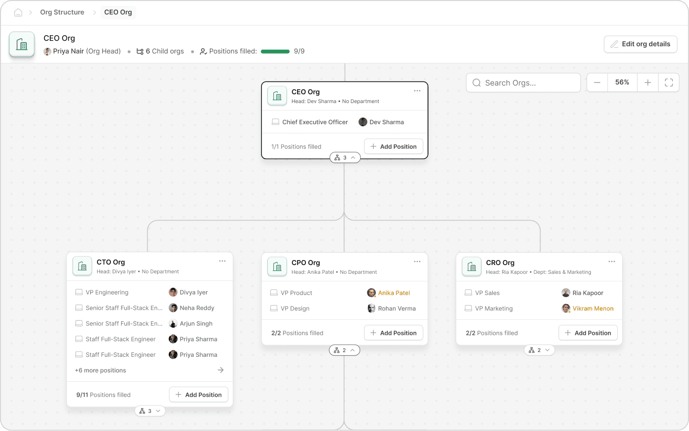
I had both views made, but I had to decide which view deserved the first look from the user, and it wasn’t very simple.
I had both views made, but I had to decide which view deserved the first look from the user, and it wasn’t very simple.

task 1
task 1
Create an Org of your choice
Create an Org of your choice
task 2
task 2
Add 2 Positions in that Org
Add 2 Positions in that Org
task 3
task 3
Edit the Org and any 1 Position
Edit the Org and any 1 Position
group 1 (list → tree)
group 1 (list → tree)
group 1 (list → tree)
Avg. task completion was ~25% faster in the list view than in the tree view
Avg. task completion was ~25% faster in the list view than in the tree view
Avg. task completion was ~25% faster in the list view than in the tree view
group 2 (tree → list)
group 2 (tree → list)
group 2 (tree → list)
Avg. task completion was ~43% faster in the list view than in the tree view
Avg. task completion was ~43% faster in the list view than in the tree view
Avg. task completion was ~43% faster in the list view than in the tree view
The list view won, but 6 users said they need the tree view “once or twice a month”
The list view won, but 6 users said they need the tree view “once or twice a month”
so, I added a mode toggle, with list view as default
So, I added a mode toggle, with list view as default
I added a mode toggle, with list view default
overshoot animation graph
overshoot animation graph

the org card
Juggling model clarity, compact layout, and clean UI
Juggling model clarity, compact layout, and clean UI
For the tree view, the node card was important to get right. I had to represent the real data structure, keep the UI clean, all while maintaining compact cards for optimal tree view experience.
For the tree view, the node card was important to get right. I had to represent the real data structure, keep the UI clean, all while maintaining compact cards for optimal tree view experience.
I explored many layouts for the Org card
I explored many layouts for the Org card

Demoting the hierarchy of org info made cards blur together: the org is the grounding element and needs top hierarchy.


Most recognisable, but flips the structure: the position contains the employee, and vacant positions had nothing to anchor to.


Count and Add Position relate to the positions, not the org: in the header they read as org-level and crowd it.

Only compact for tiny orgs: titles truncate and the card balloons. Anything other than rows was unreadable.
after more refining, I landed on the final card design


1
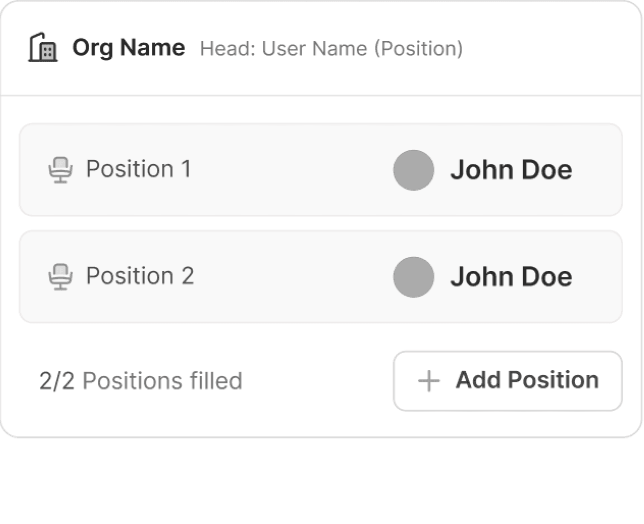
The Org
The Org
Org was the grounding node, so I treated it with the highest hierarchy.
Org was the grounding node, so I treated it with the highest hierarchy.
2
Position
Position
Position came first in the row because it was true to the real model.
Position came first in the row because it was true to the real model.
3
Employee
Employee
Since names and photos are more recognisable, I gave them more weight.
Since names and photos are more recognisable, I gave them more weight.


A
More space to establish associations
B
More padding than top to avoid overlapping with the expand button
C
Standard padding
D
Lesser space because the footer info and actions are associated with Positions rather than the Org itself
A
More space to establish associations
B
More padding than top to avoid overlapping with the expand button
C
Standard padding
D
Lesser space because the footer info and actions are associated with Positions rather than the Org itself
So, how did this redesign affect the numbers?
So, how did this redesign affect the numbers?
impact
First time Org-setup time reduced and we received fewer support tickets
First time Org-setup time reduced and we received fewer support tickets
First time Org-setup time reduced and we received fewer support tickets
59% less time for first time set-up
59% less time for set-up
59% less time for first set-up
From avg. 2 weeks to 5.6 days. Tracked from arriving on set-up page to import completion state.
75% less support tickets
75% less support tickets
Avg. 28/month to 7/month. Tracked over 2 months. Testing is still ongoing.
Thank you for reading!
Thank you for reading!
more projects